Name: Martin Chalk – CEO
Leonardo Lenchig – Art Director
Company: Chalk Creative Partners
Craft: Brand Identity
Location: Brooklyn, NY & Gorizia, Italy
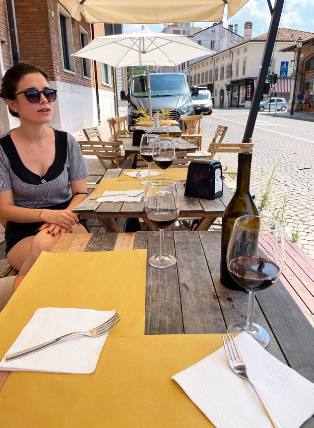
“Sometimes when you’re sitting in front of your computer for hours at a time, original ideas just don’t flow. When you’re relaxing at lunch with a bowl of pasta and some fine red wine, your mind just begins to ease a little bit and you start doodling, things just seem to get somewhere. I think sometimes when you’re the most relaxed is when you do some of your best work.”
THE PROCESS
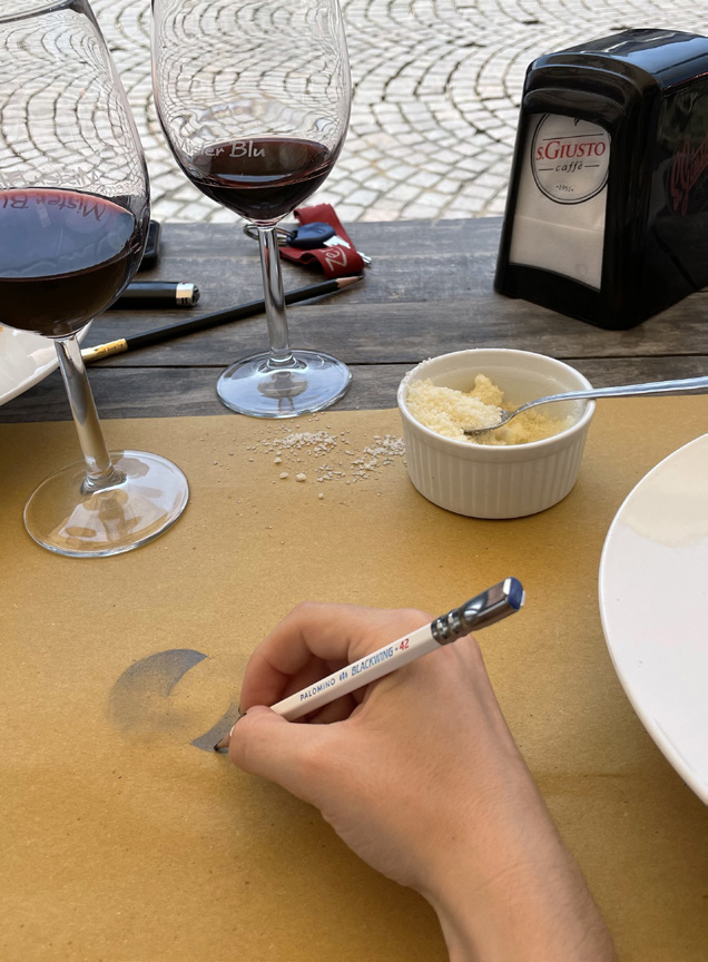
When we first heard about a team of designers were using Blackwing pencils to sketch out projects on parchment paper placemats at an osteria in a small town in Italy, we knew we had to find out more. We then had the pleasure to talk to Martin Chalk and Leonardo Lenchig of Chalk Creative Partners about how their process starts in Brooklyn, New York, travels all the way to Gorizia, Italy, and ends up being seen around the world.
Can you tell us a little about Chalk Creative Partners, your backgrounds, and how your partnership came to be?
Martin Chalk: Chalk Creative Partners does brand identity for products and services — everything from logos to product design to video. Initially, I was running a beverage company and I was trying to find someone to redo all of our packaging. After blowing most of our budget with a handful of well-established companies, we still had not seen anything close to the quality we wanted. While still on the search, I had stumbled on some fruit cup designs on Behance that were made by a small team of guys in Italy. The colors and artwork blew me away so I contacted them. I asked for a quote for 6 beverage SKUs and did not hear back for two weeks. All of a sudden, I get an email back from them asking for just 3 more days, and then they’d give me a quote. 3 days later, they sent me over the entire finished project, 50 pages of the most beautiful artwork with an amazing, well-structured layout. So I started working with them. I was so impressed and enjoyed it so much that we decided to start a company together. I’d be in Brooklyn and they would be in Northern Italy.
Leonardo Lenchig: For me, it was crazy being contacted from America. Initially, I thought it might be some sort of scam. The first project we did with Martin was our biggest project to date. Up until then, we were just doing local branding in our small village. I studied Multimedia Technology and wanted to become an architect, but I didn’t have to patience for it. The process from designing something then having to visit the construction through to completion is just not my speed. I like graphic design because it’s much more instantaneous and I can better visualize something I just created.
What do you think sets your company apart and can you give us a glimpse into your process?
MC: Leonardo, Ettore, and the others in the studio team have learned and can apply traditional art techniques from Medieval and Renaissance Italian art about what works as opposed to what doesn’t. They are able to apply these traditional concepts of spacing and typography to logo and label design. When we work with a client, we want to be able to explain every design decision, getting from A to Z, in a very structured way. In doing this, clients are able to really understand the thinking behind every decision through to the final product. It also allows us to always reverse a step if need be.
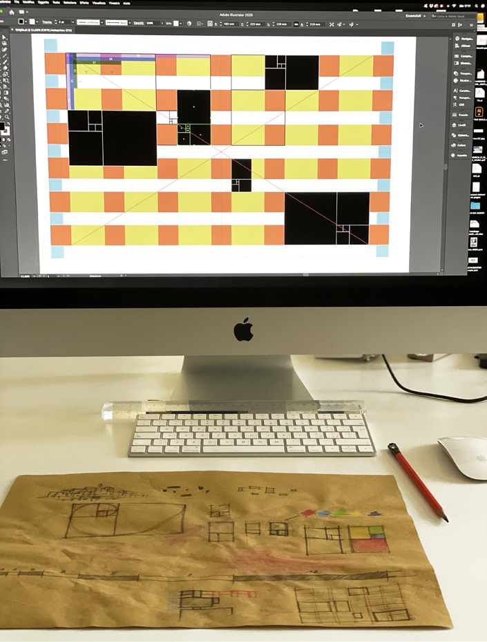
LL: Sometimes I just get an idea or hunch when first introduced to a project. I just know immediately if I want straight or round lines. If I’m working on a logo, I like to begin using geometries. Personally, the hardest part for me is keeping in mind all of the marketing stuff and that’s why it’s beneficial to work with Martin since he is knowledgeable in that area. Our approach is very structured and organized. We use a lot of grids and our designs in many ways are both complex, yet appear simple.
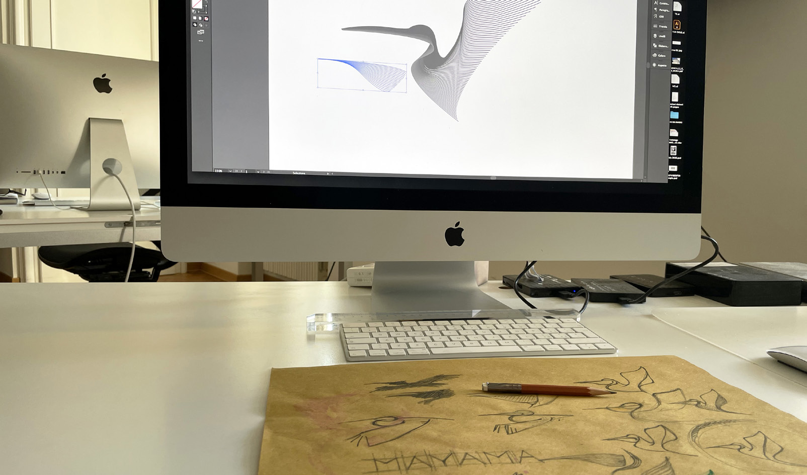
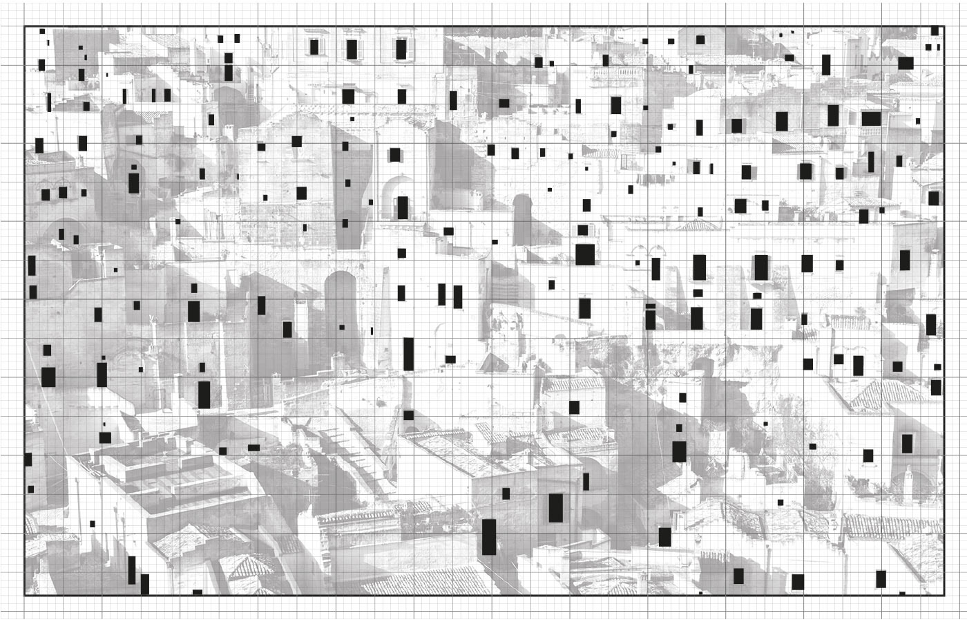
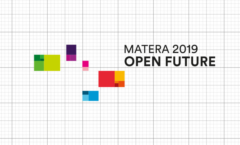
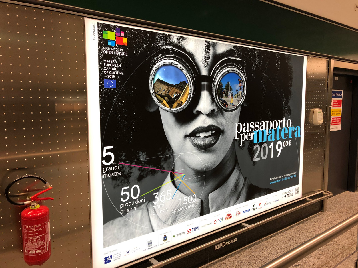
The process of creating their award-winning logo design for the city of Matera. Click the arrows to see the entire process from concept to finished logo.
Can you guys tell us more about those wine-stained parchment paper tablecloth sketches?
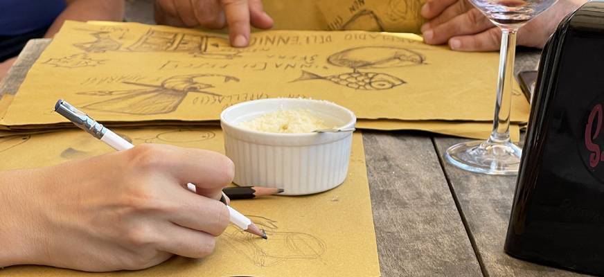
MC: I first discovered the story behind the Osteria designs because Leonardo and Ettore kept showing me these drafts hanging in the studio with stains on them. I didn’t realize the significance of the brown paper and that they were actually wine and pasta stains until I visited them in Gorizia and saw their daily routine!
LL: Sometimes when you’re sitting in front of your computer for hours at a time, original ideas just don’t flow. When you’re relaxing at lunch with a bowl of pasta and some fine red wine, your mind just begins to ease a little bit and you start doodling, things just seem to get somewhere. I think sometimes when you’re the most relaxed is when you do some of your best work.
Is this lunch spot somewhere you go every day?
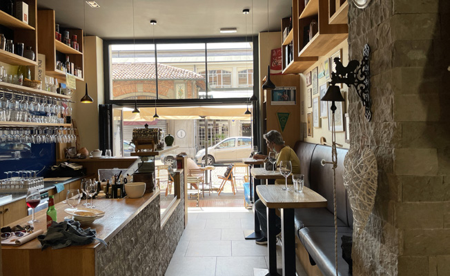
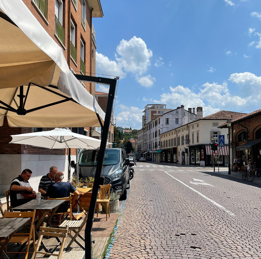
LL: It’s right around the corner from the studio so we go there pretty much every day. It’s a simple but friendly Osteria with only three tables. We are regulars. There’s a lot of people having fun there and a little day drinking taking place. But that’s pretty normal in Italy.
MC: It’s a very nondescript type of place. When I went there, the owner lays down the tablecloth, puts down a carafe of wine and water and there are only really two choices. There’s bread with meat and then there’s a pasta choice. There’s no menu and no bill, it’s just a tab system. On my visit, the owner brings me to the back and showed me a cupboard of Ettore’s sketches. Sometimes he would just exchange drawings for food like the great painters did at La Colombe d’Or. Some of these sketches are now hanging in the Osteria.
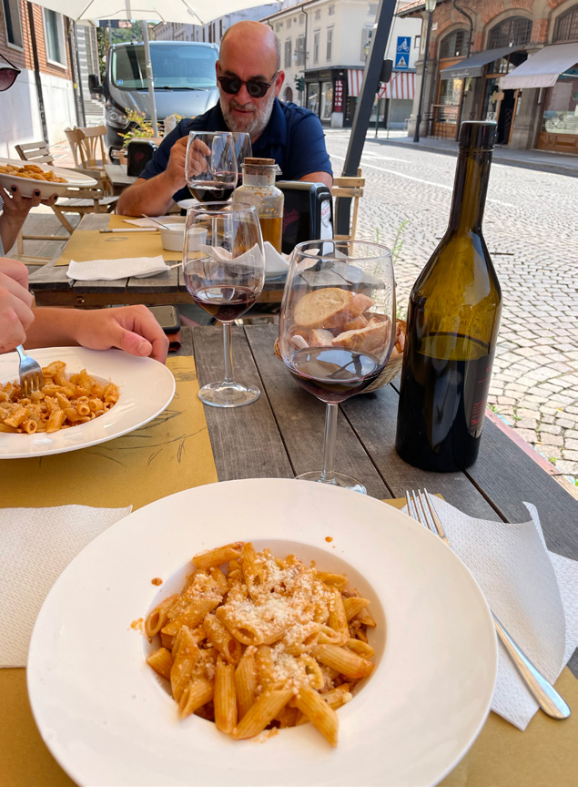
The team sitting down for lunch and sketching with Blackwing pencils at the local Osteria.
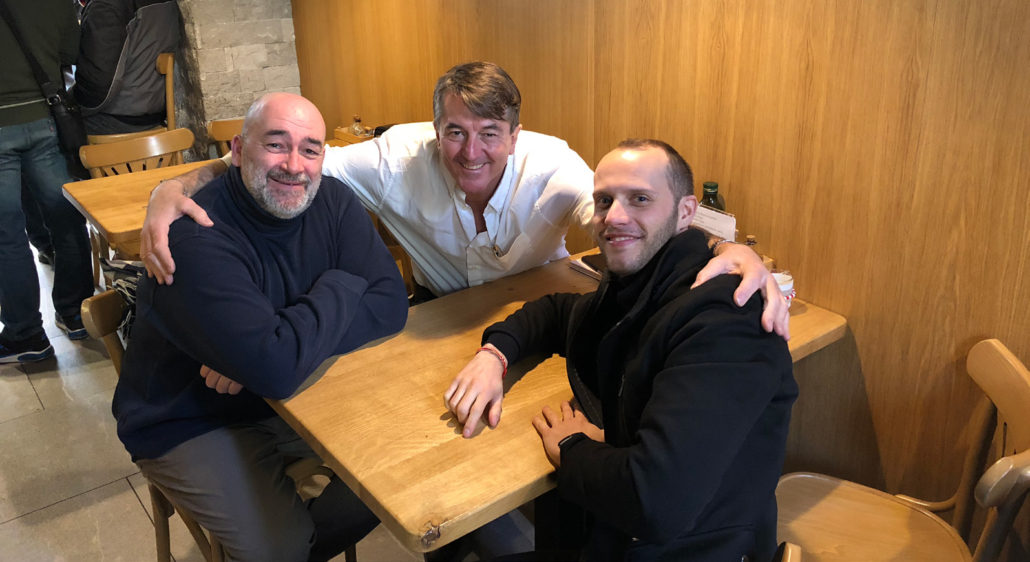
Left to Right: Ettore Concetti, Martin Chalk, and Leonardo Lenchig at the Osteria.
Are there any quotes or philosophies that inform your work?
MC: There’s quite a few, but one I’ve been wanting them to hang up in the studio is “Simple is hard.” In design, it’s always easier to overcomplicate. When people see a clean or minimalistic design, they often don’t understand that it’s actually very difficult to achieve that. A lot of the time, we arrive at a design and then we being to strip away at it. We talk about how we can pair it down to convey the same message without being too much in your face.
LL: I agree with Martin, that’s our motto now. I also like “God is in the details” by Mis Van Der Rohe and “The life of a designer is a fight against ugliness.” by Massimo Vignelli. Those are my mantras. I always factor in these as inspiration when I analyze my work. Is it proportionate and is it pleasing to the eye? I also always say “ A good design is timeless” It’s become a personal motto too.
What does analog mean to you, how did you first find out about Blackwing, and how do you use Blackwing products?
MC: Analog is so important to us. I think so much gets lost when you’re on your computer all the time. I feel like I have a more productive time doing everything on paper and then translating it to digital. Growing up, my mother had opened a card shop and my sisters actually started their own greeting card company so I’ve always been a fan of stationery. A shop opened near me in Brooklyn called Yours Truly. That’s where I initially saw the Blackwing Volume 4 about the Mars Rover mission and I read the story and was really impressed. Once I started researching the Volumes program, I began collecting as many as I could find. I started amassing a surplus of pencils and began to send them over to Italy for the studio to use. When I started diving deeper, learning about the Blackwing Foundation and the other programs, I felt like Blackwing was a company we could really identify with and have brand loyalty to. There is a lot of honesty and authenticity with Blackwing as a brand and with the products. Now it’s the only brand we use.
LL: We loved when Martin sent over the Blackwing Pencils and then the Blackwing Colors. The firmness of the cores are very great to use. We were blown away after using them. Sketching with Blackwing pencils is always the first step for me.
What are some pieces of advice you’d give to someone pursuing a creative lifestyle?
LL: I’d say that one should not pursue a creative lifestyle expecting the work to be easy or that you will make a lot of money from it. You have to do it because you love to do it. Your motivation should come from passion. I enjoy the work so much that it becomes just a part of my life. I’d also say to focus on what you’re passionate about and good things will come your way. Also studying and setting a goal of learning something new every day is extremely important.
MC: Learn from criticism. Don’t ignore it as just haters. I think it’s like learning a sport. Criticism is like coaching. You don’t have to accept all of the criticism, but you should be able to hear it from people you respect and treat it as advice and adapt it to your style. People in the creative arts often have a singular inflexible vision, but commercial success comes from following advice. I believe a lot of the greats embraced this. It’s really important to identify coaches early in your career and learn from their successes and mistakes.
Last question, what are some fun things or what is your ideal day in the north of Italy?
LL: Eating a great meal at a good restaurant. I wouldn’t be Italian if I didn’t say that. I also love to visit museums and exhibitions. I love traveling into Venice to see what’s going on. There’s so much beauty in Venice. We also have the Alps close by and lots of beautiful nature which is very relaxing. I think I sometimes take where I live for granted, but I love it here.
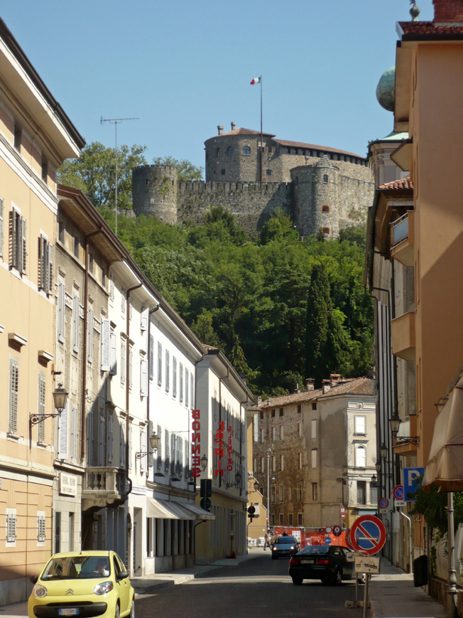
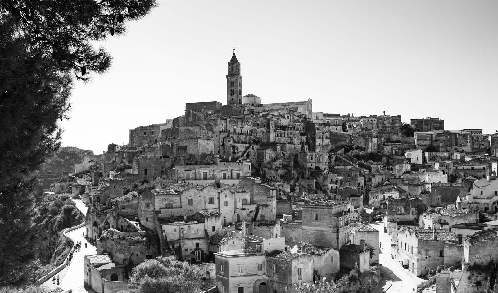
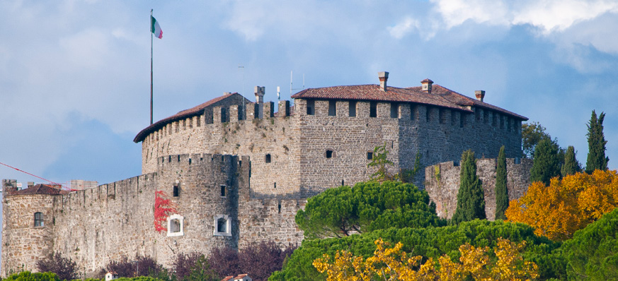
Gorizia, Italy, home of the Italian Chalk Creative Partners team.
Photos provided by Chalk Creative Partners


